Did you know that a thank you page after payment can act as an efficient selling machine for your business?
The reason is that users that land on your thank you page are highly engaged with your business. They’ve already committed to buying from you, meaning they’re at the peak of their convertibility. Don’t leave them hanging!
Use your thank you page after payment to make additional sales, gain loyal customers or at the very least, squeeze some extra engagement so that your business can grow.
How?
This guide will walk you through the exact steps!
What is a thank you page after payment?
Just to make sure we’re on the same page, let’s briefly discuss the meaning of a thank you page after payment, or with other words, a payment confirmation page.
A thank you page after payment is a page on your website where users are automatically redirected to right after they completed a purchase.
For example, imagine you’re selling a product on your WordPress site. Once a customer completes their purchase, they are redirected to a thank you page. This page not only confirms their transaction but also expresses your appreciation for their business.
The core intention of a thank you page is to show your appreciation and confirm the action of the user.
Why do you need a thank you page after payment?
If designed in the appropriate way, the purpose of your thank you page after payment can go well beyond showing your appreciation. It has the potential to give your business countless conversion opportunities and even skyrocket your revenues.
When a person reaches your thank you page, any additional request seems less daunting. So strike while the iron is hot! Use your thank you page to increase the order value, win over new and retain existing customers, and spark viral growth! Most eCommerce businesses strategically add additional products or special offers to their thank you pages. When a customer reaches this page, they’re in a buying mindset, making them more receptive to additional suggestions.
Additionally, a thank you page can make your life so much easier when setting up conversion tracking, be it using Google Analytics, Google Ads, or any other platform.
A thank you page is more than just a polite gesture. It can bring value to your business and your customers.
- Confirms payment: It shows customers that their payment was successful. This gives peace of mind and builds trust.
- Provides next steps: You can let them know what happens next. For example, tell them about delivery details or how to access a purchased product.
- Increases engagement: Use the thank you page to invite them to explore more. Share a blog post, suggest joining a mailing list, or offer a discount on future purchases.
Thank you message vs. thank you page
Now you might be wondering: isn’t a simple thank you message sufficient for achieving the same goals?
The short answer is: no.
Although a thank you message may be easier to implement, it has some serious drawbacks. Namely:
- A simple thank you message leaves users on a conversion page which doesn’t provide them any additional value. The result? They will leave.
- Since the space for a thank you message is very limited, you won’t be able to convey the right messages.
The essential elements of a thank you page after payment
While there are many ways in which you can design a thank you page after payment, the below elements are considered as a must-have:
1. Saying “thank you”
Creating a thank you page without saying “thank you” to your customer is like going to the gym, only to sleep on the treadmill. Saying “thank you” is the first step towards creating reciprocity.
But how to say thank you in a way customers know you mean it?
Make it feel human: you can express your gratitude in a brief video, but even a quick “Thank you for your purchase” note from yourself or your team feels more genuine than a generic corporate message.
2. Confirming the transaction
Your thank you page after payment should confirm the successful transaction and display all relevant information (like billing and shipping address, transaction amount, user account and login information, or download URL for digital products).
3. Fending off buyer’s remorse
For buyers, the post-conversion moment can be nerve-racking. Questions like “Did I make the right choice?” or “Will my package arrive in time?” may arise in their minds.
Your task is to make them feel good about the purchase. So don’t forget to include elements in your thank you page after payment that reinforce those positive feelings. These can be positive reviews or in case of accepting donations, a tangible demonstration of a donation’s impact.
Making clear what comes next
Make sure to include in your thank you page text what the buyer should expect next from your side. Is it a phone call within 24 hours? An immediate verification email including the next steps? Or the tracking number for the package to be sent via email?
Answer all questions your customer might have right after the purchase. Also, don’t forget to add an easy to spot Call to Action button to tell users what to do next.
How to turn your thank you page into a goldmine
Now that you’ve become familiar with the essential elements of a thank you page after payment, let’s look at those elements that make the real difference when it comes to scaling up your conversion rate!
1. Offer cross-sells
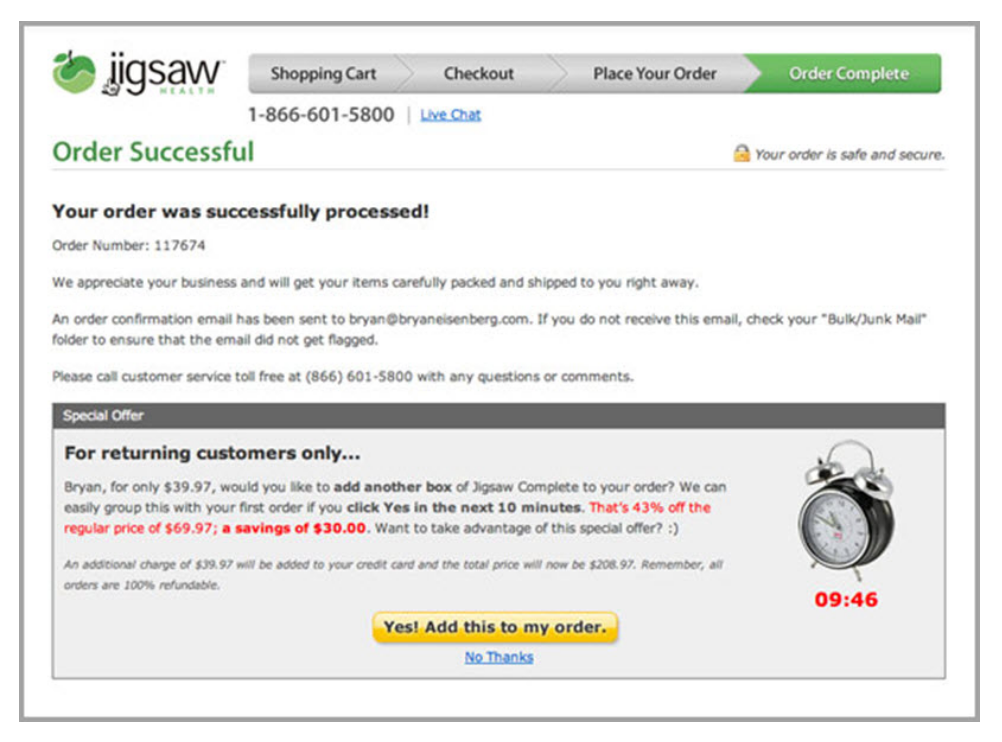
Cross-selling might scare customers on the checkout page. However, users who have just bought something from you are in their prime stage. Meaning, they’re more likely to convert again right after the purchase than, let’s say, 1 month later. That’s why they might feel quite positive about 1-click deals, especially if the offered products are tailored to their needs.
Hence, use your thank you page after payment to encourage your customers to buy more from you! You can add a sense of urgency by offering discounts on some products within a limited time window.
Jigsaw provides a perfect case in point here:
2. Provide delayed account creation
Once users decide to make a purchase, they expect a fast and seamless checkout experience. Asking for an account creation at this stage of the consumer buying process might deter them from completing the order. So what’s the solution?
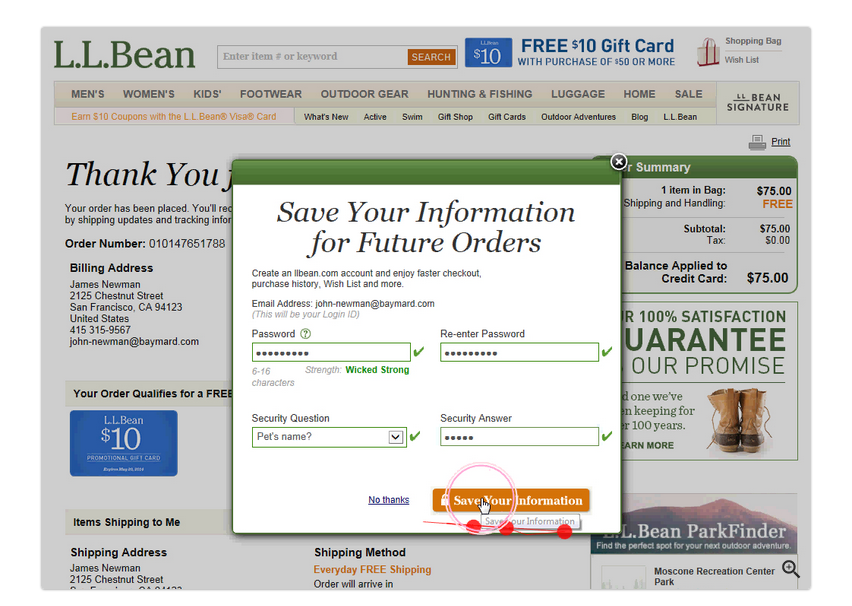
Moving the account creation to the thank you page after payment vastly simplifies the checkout process. This way, you cut out steps and relieve the customer of the burden of making tough decisions before the purchase.
To increase conversion rates, don’t forget to promote the benefits of creating an account. Additionally, to make the process even faster, use customers’ email addresses as their username, just like L.L. Bean does:
3. Offer content for instant gratification
Do you want to delight your customers right after they’ve made a purchase?
Your thank you page after payment is the perfect place to build excitement and improve consumer satisfaction!
How?
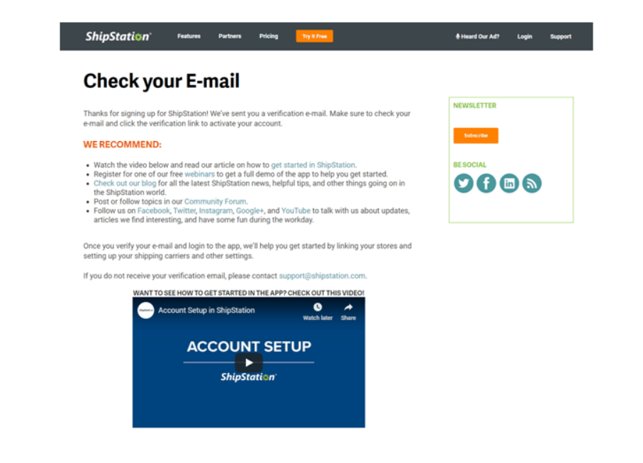
You can place guides, videos, and other types of content related to the ordered products that the customer can enjoy while waiting for the product to arrive. Just a few examples:
- Does the product require assembly? Share step-by-step video tutorials to help your customers avoid frustration.
- Did someone sign up for your webinar? Show related blog posts that might interest him or her.
- Did you just sell a smoothie blender? Link to content that will help your customers prepare the most delicious joghurt drink on their first try.
Check out ShipStation’s example:
Do you have an irresistible offer that makes people really excited about their purchase?
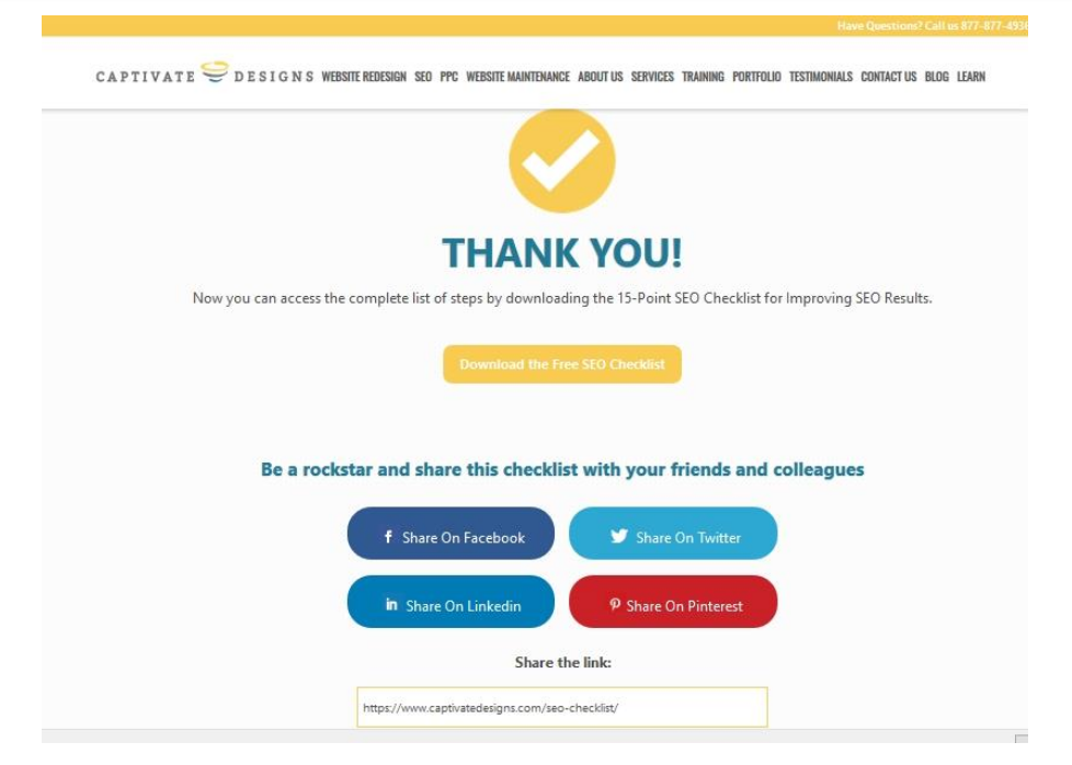
Seize the opportunity and prompt customers to share their purchases on social media – you will be amazed, how willing people are to spread the word! The reason is that in a state of excitement, people think and behave very differently. A good deal sparks the “ego-expressive” response: people are proud of finding and seizing the given opportunity. That’s why they are more likely to share it with others.
To capitalize on this excitement response, use social sharing icons on your thank you page after payment. This way, you can convert your thank you page to a growth hacking tool.
Some inspiration from Captivate Designs:
5. Reward referrals
Did you know that 74% of people identify word-of-mouth as one of the primary influencers in their purchasing decision?
If you ask for referrals, getting new business on board won’t be such a great challenge anymore. But how to make the system work?
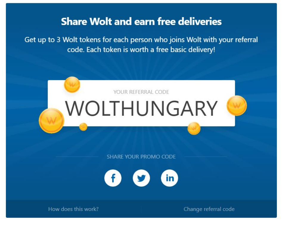
You can offer special rewards like discounts, free products, or upgrades on your thank you page after payment to users who invite their friends.
For example, Wolt offers free delivery to those who refer them to their family and friends using their referral code:
Create the perfect thank you page after payment using WP Full Pay
Did you know that you can create beautiful and efficient thank you pages using WP Full Pay, the reliable and secure Stripe Payments Plugin for WordPress?
You can even customize your page with dynamic content by using placeholder tokens to insert data entered by the customer or any other data of the transaction (such as customer’s cardholder name, gross payment amount or name of the purchased product).
If for any reason you don’t wish to create a new thank you page after payment, you can also display a confirmation message or redirect the user to an external URL. Here, you can find a step-by-step guide to configuring your perfect thank you page for payment confirmation.
You might also like to read about how to solve checkout abandonments.
Summary
Users that land on your thank you page after payment are highly engaged with your business. They are in an extremely positive state to consider any other offer you might have. That’s the reason why thank you pages have the potential to give your business countless conversion opportunities and even catapult your sales.
So don’t make the mistake of thinking a purchase is the end of your funnel! Use your thank you page after payment in smart ways to convert new customers, retain existing ones, and even create brand advocates!