You’ve set up your donation page, included everything you think might be important to capture your supporters’ attention, but donations don’t keep rolling in as planned?
The truth is that oftentimes, an organization’s donation page is its own greatest enemy in converting visitors into supporters. If a donation page is disorganized, difficult to navigate, or confusing, it defeats its own purpose: raising funds.
So, what’s the secret formula to crushing your fundraising goals?
While the perfect donation page template doesn’t exist, there are some essential best practices that, if followed, can make a real difference in driving gifts. Let’s find out what your donation page is missing!
Is your donation page mobile-friendly?
Mobile accounts for approximately half of the web traffic worldwide: in the first quarter of 2021, mobile devices generated 54.8% of global website traffic.
From connecting with friends to asking Siri questions, people have come to rely more and more heavily on their mobile devices. Similarly, a great portion of your donors access your site on their smartphones to submit donations.
The task is clear: you have to create a mobile-first design. How?
Look for a donation page platform that offers mobile responsiveness. All of the text, images, and forms on your donation page should adjust to fit the screen size of smaller devices. Keep your layout vertical, and make sure to use large text and buttons!
Take a look at Fred Hutch’s donation page that offers a fully responsive experience:

Beyond featuring a responsive design, you should also aim to speed up the page load time. The reason?
As the load time goes from one to ten seconds, the probability of a mobile user bouncing increases by 123%. Account for this by reducing the number of fields and compressing images!
Is your donation page secure?
Keep in mind: supporters give away their most sensitive data on donation pages. They need to know that your donation page is 100% secure. If you fail to give them a peace of mind, there’s a high chance that they’ll leave your site.
How to ensure a secure online payment?
Opt for a donation platform with a secure payment processor such as Stripe. Furthermore, your donation page URL should start with “https”. The “s” at the end stands for SSL and allows all confidential information (e.g. credit card numbers) to be safely transmitted. Similarly, if your company is PCI DSS compliant, it signals your donors that your business is safe.
How to emphasize the security of your page to your donors?
The easiest way to do so is to place trust seals near your form. A trust seal – or in other words a trust badge – is an icon placed on your website that ensures users that their personal data is handled safely. An example :

Take a look at Project C.U.R.E’s donation page showcasing a security seal right next to its donation form:

Do you keep branding consistent?
Imagine that you’ve landed on the donation page of a nonprofit you would like to support. You know the organization, you’ve already explored their website and signed up for their newsletter. However, you simply cannot recognize them on their donation page: the colors don’t seem to match the color scheme of their website, you can’t find their logo anywhere, and the URL contains a string of random letters and numbers. Will you donate?
Probably not.
The chances that you’ll trust that donation page enough to enter your payment information is quite slim.
The moral of the story?
Always include your organization’s brand elements on your donation page! This creates consistency, which is key to establishing trust with your donors.
Always include your organization’s brand elements on your donation page! This creates consistency, which is key to establishing trust with your donors.
Consequently, when designing your form, it should reflect the look and feel of your organization’s website. Use the same color scheme, design, font, and language as you would on your website. Furthermore, include your logo in the top left corner of your donation page so that donors can immediately be sure they’re interacting with your organization.
Take a look at Asian Pacific Fund’s donation page where the color scheme blends well into the brand’s colors:

Is giving simple on your donation page?
“How much should I donate?”
This is the most difficult question your supporters have to face when donating online. Oftentimes, they can’t figure out what’s the right amount to help your cause. This dilemma can drive them away from your donation page. And that’s where suggested donation amounts come into the picture!
Suggested giving amounts are optional gift amounts that your supporters can choose from to give to your organization. They facilitate the whole donation experience, as people don’t have to come up with a given amount themselves.
To maximize your donation revenue, tie each donation amount to a tangible gift! You may include a simple statement such as:
“A gift of $30 will feed a puppy for an entire month.”
Check out how American Forests takes the guesswork out of its donation form:

Additionally, you may allow your donors to cover the processing fees. This way, you can effectively increase your revenues, and your donors get to contribute the exact amount they intend to donate for your cause.
Does your donation page encourage recurring donations?
Did you know that the average recurring donor will give 42% more in one year than those who give one-time gifts?
Without a doubt, one of the best ways to hit your fundraising goals without lifting a finger is by encouraging recurring donations.
Follow these tips:
- Make it easy on your donation form for supporters to check a box that will allow them to donate on a regular basis.
- Allow donors to update their personal information and recurring giving preferences with a few clicks.
- Acknowledge recurring gifts each time by sending personalized thank you emails.
Check out UNFPA’s donation page which offers an option to choose between giving once or monthly:

Do you keep your donation page simple?
Your donation page shouldn’t confuse your supporters. It should provide a simple online donation process.
You might also like to read: using the ‘Rule of Three’ for fundraising success.
When designing your donation page, keep the following tips in mind:
The less time your form takes to complete, the more donors will make it to the end and submit their donations. So keep your donation page to one page with as few required fields as possible.
- Reduce the number of your CTA buttons
The call-to-action should be as crystal clear as possible for the visitor. Consequently, there should be just one “submit” button at the bottom of the page!
Make clear what the page is about and what you want users to do. Limit the amount of copy, images, media, and links to only what’s necessary, and organize your content in a logical way.
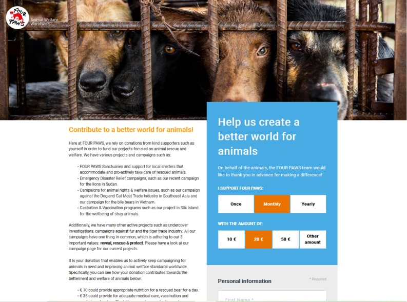
For instance, FOUR PAWS International uses just one emotionally appealing image on its donation page that represents the organization’s mission:
Does your donation page contain a compelling story?
Your supporters give to you because they care about your story.
That’s why you should fill your donation page with content that inspires people to give. Easier said than done?
Here are the exact steps you can follow when building your donation page.
1. Write a great headline
The headline is the first element that catches visitors’ eyes on fundraising sites. Therefore, make sure to use actionable, value-driven words that entice people to complete your donation form. For instance, remind your donors why they felt they had to donate in the first place.
2. Describe your mission
Your fundraiser description length should be short and sweet.
Here are the most important questions your donation page should answer:
- Who’s benefiting from your fundraiser?
- What’s the main obstacle?
- When do you need the funds?
- Why do you or the recipient need help?
- How can donors help?
Describe the recipient as honestly as you can. Explain why this person, group of people, or organization is so deserving of financial help. Additionally, don’t forget to tell supporters why their contributions are critical. List specific expenses that you or the recipient need help paying. These details help people understand what impact their donations will have.
3. Write a CTA people can’t help but click
You might be surprised to learn how much the donate button on your website can affect click-through and conversion rates. In other words: the call to action on your donation page can make or break your fundraising plan.
Try experimenting with different copy. For instance, instead of “submit”, try:
- Send your gift
- Join the fight
- Make an impact
- Make a difference
- Sponsor a child for summer camp
- Be the change
- Plant a tree
- Save a pup
- Be a hero
Take some inspiration from water.org’s donation page:

You can also put the CTA in the perspective of the beneficiaries of your cause. Use emotionally appealing pictures together with words like:
- Find me a home
- Keep me warm
- Feed me
Do you show gratitude to your supporters?
When you’re busy setting up a donation page, it’s easy to forget to thank your donors. Be aware: without the generosity of donors, your fundraiser wouldn’t be possible.
Setting up a thank you page will not only enable you to confirm the transaction but can also encourage repeat donations. With this simple step, you can build a passionate community that remains engaged and dedicated to your cause.
So, what does the perfect thank you page after payment look like?
Here’s an example of World Help:

Considering the above best practices, the question may arise: which platform is the best to accept donations?
With the online payment processing platform Stripe and the WP Full Pay WordPress plugin, you can easily set up and embed a donation form on your website that converts!
How WP Full Pay helps you build a well-designed donation page
With WP Full Pay, you can easily set up suggested and custom donation amounts. The supported donation frequencies are one-time, daily, weekly, monthly, and annual which makes it easy for your supporters to decide to give on a regular basis.
You might also like to read how to accept donations on your WordPress with WP Full Pay.
Furthermore, with the help of the plugin, you can easily collect the billing and shipping address of your donors which helps you build a strong relationship with your supporters.
To design your donation page entirely according to the specific needs of your organization, up to 10 custom fields can be added to your donation form.
Additionally, the plugin provides a Customer Portal to donors, where they can update the default card used for recurring donations, cancel recurring donations as well as download invoices.
With the help of the plugin, you can even create a beautiful and efficient thank you page after payment as part of your stewardship plan. Furthermore, you can send fully customized donation receipts with the plugin.
To adhere to cybersecurity measures, the plugin offers simplified PCI compliance, provides customizable solutions to help you meet SCA requirements and enables you to add CAPTCHA protection and set minimum donation amounts to mitigate card testing attacks.
You might also like to read: 8 cart abandonment reasons and how to increase on checkout conversion rates.
Bottom line
As a nonprofit organization, you put a lot of time and effort into attracting donors and priming them to contribute to your programs. This is why you simply can’t make the mistake of overlooking the importance of a well-designed donation page.
Make sure to create an eye-catching yet simple and easy to navigate page by taking inspiration from the above donation page examples and following our best practices.
Remember: even simple changes to your donation page can make strides towards a successful fundraising campaign!